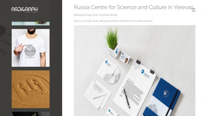
The website was developed from detailed design with every margin, pixel, sizes exactly predefined.
During development was implemented a pixel-perfect approach to get exactly the same as in design.
Solutions:
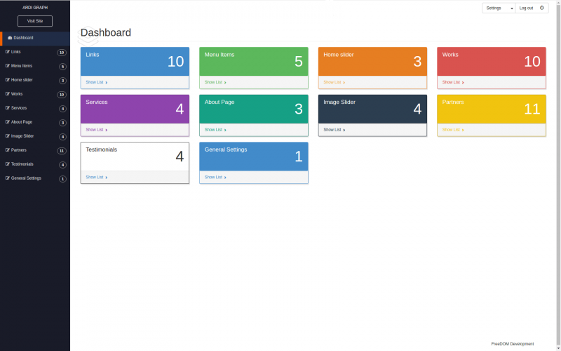
- Custom CMS
- Progressive design solutions
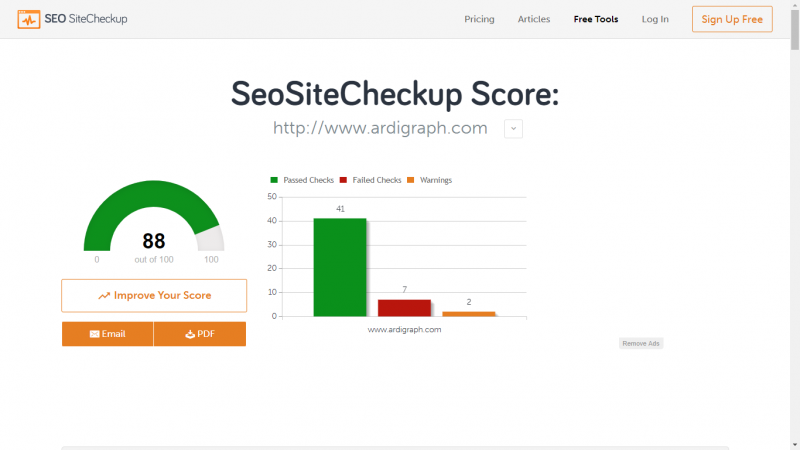
- SEO optimization
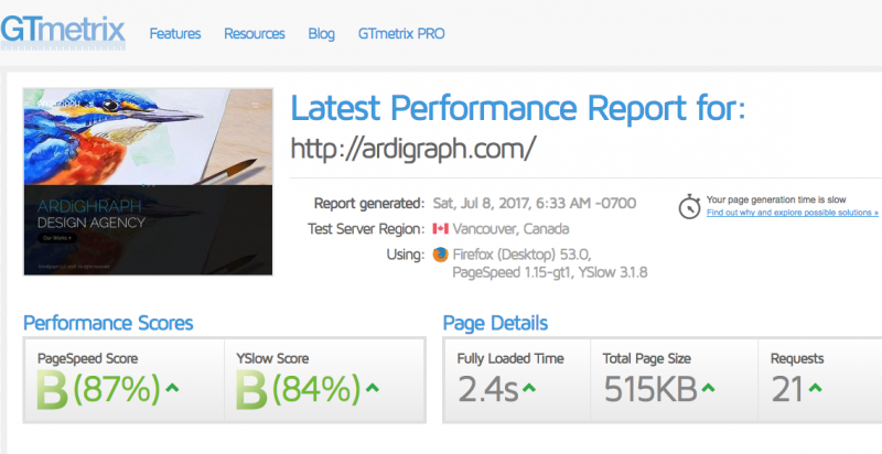
- Page Speed optimization
- Dynamic functionality
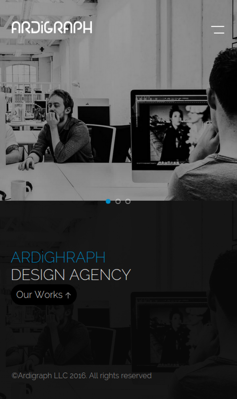
- Mobile responsiveness